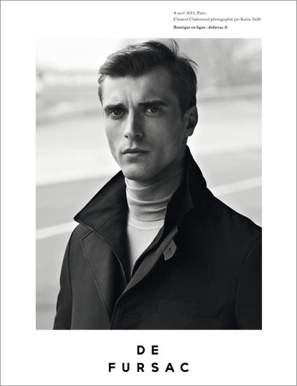
I’m loving De Fursac’s Fall/Winter 2013 campaign and had to share for those of you who haven’t seen. I’m particularly drawn to the clip on Vimeo. The slightest glimpse of driving gloves and I’m in love! Shot in black and white, the greyscale of the clip accentuates the cut of the garments including the beautiful lines of the coat and the crispness of the pattern on the tie. Beautifully balanced overall with music to match.
The campaign hosts four images featuring model Clément Chabernaud and photographed by Karim Sadli. Karim alongside Artistic Director Frank Durand and Thibault Oberlin, created the new visual identity for De Fursac in 2011. The strength of the identity carried through just as strong today.
See more of De Fursac online here – www.defursac.fr
[vimeo http://www.vimeo.com/68836770 w=400&h=300]





Leave a Reply